Tags & Description
Serifs
feet/ extensions that are finishing strokes of letterforms/ also known as footers
Bowls
rounded letters (like on the "a")
Arms
strokes that extend from the stem ("E")
Ear
sticks out of letter
Spine
curve ("S")
shoulder
curves
Leg
extends to baseline
Tail
hangs down
Cross bar
horizontal stroke in middle of letter ("H")
Cross stroke
crosses over stem ("f")
Bar
line in between the space of where a letterform connects ("e")
Counterspace
enclosed space within a letter ("a")
spur
think cowboy spur on boot
jot
dot that can be seen in lowercase "j" and "i"
terminal
endpoint of a letter
apex
when two strokes come to a point
link
connecting stroke
ligature
connection between a specific pair of letters/smooths connection for legibility
examples of ligatures
ff, fl, fi, ffi and ffl
French word for "no"
Sans
What are the five basic classifications of a type face?
Old style, Transitional, Modern, Slab serif, and Sans serif
Oldstyle
Roman serif type created between late 15th century and mid 18th century; low contrast between thick and thin strokes, thick bracketed serifs, long ascenders and descenders, body has smallish spaces
Transitional
stylistic bridge between Oldstyle and Modern; sharper and flatter serifs, tighter bracketed curve, stress in the curve is more vertical, higher contrast between thick and think strokes,
Modern
made its first appearance in late 18th century; extreme contrast between thick and thin strokes, ultra thin unbracketed serifs (horizontal or nearly horizontal)
Slab serif
emerged in mid 18th century; useful for signage, has weight and strong presence, serifs are usually unbracketed or square, lack of contrast between strokes (almost equal weight)
Sans serif
emerged in late 1800s; evolved from needs of advertising
What are the three main categories of Sans serif?
Grotesque sans serifs, Humanist sans serif, Geometric sans serif
Grotesque sans serifs (Gothic)
slight variations in stroke width, letters are fairly wide and rounded letters are often a bit squared off
Humanist sans serifs
proportions of classical Roman letters, if you look closely you will see some of the proportions of hand-letter Roman letters
Geometric sans serifs
reflect the modernist movement of the early 20th century; based on the geometric forms of the circle, square, and triangle;
On a typewriter, how are the letters spaced?
monospaced
Where are commas and periods placed when using quotations
inside of the quotation marks
What is a widow?
a word or part of a word that is hanging out at the end of a paragraph
What is an orphan?
a word or a part of a word at the top of a column
How many spaces do you put after punctuation on a computer?
one
Explain the Gestalt Theory
assembly of elements is perceived as more than the sum of it's parts
What are the Gestalt Laws?
Continuity, closure, common fate, figure/ground, proximity, similarity, and symmetry
A lowercase "w" is wider than a lowercase "i" on a computure
True
Who helped in the creation of the typographic measurement system?
Gutenburg
What did Gutenburg invent?
Printing press
What is alignment?
arranging letters well
What are the types of alignment?
Flush left, flush right, centered, justified, and random
Kerning
adjustment of the spaces between two specific letters
Tracking
adjustment of the space between a group of letters
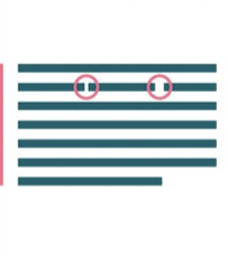
Where will the narrowest space be in type?
With rounded letters side by side ("po")
Where will the medium wide space be in type?
With a straight side and a rounded side ("ho")
Where will the widest space be found in type?
When two straight typefaces are next to one another ("HH")
How many picas are in one inch?
6 picas
How many points are in one pica?
12 points
How many points are in one inch?
72
Fill in the blank: Heavy strokes can _________
distort small type
True or false: Never downsize acronyms or numbers.
False
What is the primary goal for type?
To visually communicate
What is the difference between text type and display type?
Text type is designed to be read in large quantities vs Display type is designed to be read in small quantities
What size should text type usually be?
8-10 point
What size should display type usually be?
14+ point
Should be "icing on the cake" for typefaces:
Display text
What is the minimum number of words per line in order to avoid gappy word spacing?
6
When do we stack text?
Never
Lines of text are measure in:
Picas
How did Debra Adler specifically redesign the prescription bottles?
Changed the typographic hierarchy, adding color, enlarging most important type, and using a more legible typestyle
What are dumb quotes?
Used for feet or inches
What are smart quotes?
Used for genuine quotations, the two pairs are flipped
Why is word spacing important?
Legibility and readability
What is one way to know how type faces go together?
Choose similar body heights and make the styles different for a contrast
When combining typefaces, they should do what?
Live harmoniously with one another
How do you organize and identify type?
Typographic classification
Instead of stacking text, what is an alternate solution?
Tilting the text onto its side
What is typographical hierarchy?
Visual organization
When is it acceptable to stretch and squash text?
Never
True or false: It is acceptable to artificially bold typefaces.
False
What is an alternate solution to artificially bolding typefaces?
Find a typeface that has a bold variation for it
Why are grids the building blocks of design?
saves time, unifies project, dividing space, arranging content, contains text, give structure, cohesiveness to project
True or False: Computer typography is proportional.
True
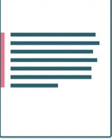
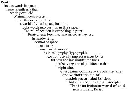
This is an example of what alignment?
Flush left (rag right)
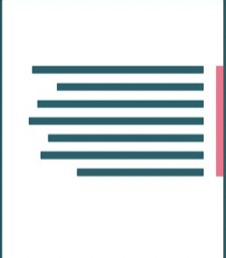
This is an example of what alignment?
Flush right (rag left)
This is an example of what alignment?
Centered
This is an example of what alignment?
Justified
This is an example of what alignment?
Random (Assymetrical)
Monospaced
width of letterforms share the same between all other letterforms
What are the 3 don'ts of scale and contrast?
Make everything look important
Not being bold enough
Not understanding how to use contrast on complex/busy background
True or False: Typography can be emotional.
True
True of false: The more effects the better.
False
Give examples of enviromental design and way finding
Airports and Stadiums
What is the best way to educate the typographical eye?
Pay attention to the world around you, typefaces are everywhere
When can you break the rules of typography?
When you understand them
Type is measure in
points
What are proper proportions?
the way in which typographic elements interact with each other
What is the typographic theory of relativity?
the role of proper proportions in typography
What is a type family?
a group of related type faces which share similar design characteristics and are designed to work together
True or false: Type has a personality.
True
What are the three most common variations in a font family?
Weight, width, slope
Part of a letter than extends below the baseline are called:
Descenders
Typographical color is based on what four variables?
Typeface, size, leading, and tracking
Part of a letter than extends above the x-height are called:
Ascenders
X-height
the height of the type
What are the invisible boundaries of extenders called?
Ascender and Descender lines
Type sits on a ________
baseline
What is the invisible boundary around the shape of a letter?
body width
What is the shortest of all dashes?
Hyphen