


Data Trends
Many of the science exam questions provide rewards for those who can identify trends in the provided data. When charts or graphs are provided, take some time to identify the variables being plotted and make note of any links that seem to exist between them.
If one variable rises when the other rises, there is a direct relationship. When one variable falls while another rises, this is known as an inverse connection.
A trend is a pattern that demonstrates a clear and uncomplicated link between the facts. Try to write a phrase that concisely describes what is occurring in the graph in order to spot a data trend.
But beware—there may not actually be a trend. Some graphics lack trends, but the majority do. It's crucial to avoid imposing a trend when none exists on the data.
How quickly you can spot patterns influences how quickly you can comprehend a paragraph and respond to the questions.
Common Data Trends
Direct Proportion: Variables 1 and 2 increase or decrease simultaneously
 Inverse Proportion: Variable 1 increases, Variable 2 decreases (or vice versa)
 Exponential growth: Sometimes referred to as a “J curve,” exponential growth begins increasing slowly, then increases more and more quickly:
 Logistic growth: Sometimes referred to as an “S curve,” logistic growth resembles exponential growth in the beginning, but then encounters limits to growth and levels off:
 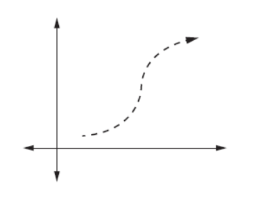 Unfamiliar Diagrams
In the science exam, if you come across a new kind of diagram or model, read the question first so that you can start looking specifically for the information you need. Don't try to grasp the full graphic at once. You may conserve both time and mental energy in this way.
Numerous lines on a graph or several columns in a table are examples of several data sets that can be included in a visual. You might also need to understand how the data sets differ with respect to those variables in order to comprehend how two variables are connected. This line graph displays data from many data sets: